2007 Complex Individualism
2 Minute Read
True, predicting the color of fashion is not an exact science like meteorology. But since the mid-1970s, professional color forecasters have been able to tell us — in subtle detail — what colors will predominate in fashion, home design, and consumer products up to two years in advance by studying current trends and probing our collective psyches.
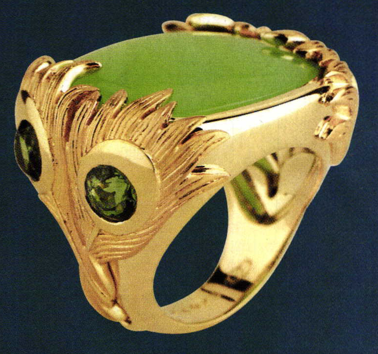
What they predict for fashion in 2007 is a continuation, and deepening, of trends that took hold post-September 11: urbane sophistication, concern about nature and conservation, a desire for personal expression, and a quest for tranquility. In terms of color, we'll be seeing a predominance of soft shades of pastels, beiges, and browns; rich reds, purples, and blues; and exotic new color combinations. Most forecasters agree that gemstone jewelry will provide much of the color relief in a largely monochromatic landscape, as wearers stack, layer, and combine jewelry to stand out from the crowd.
"Jewelry — this is where the attitude comes in. It's not about one color," says Britt Bivens of Promostyl. "Accessories are very important. A lot of people I know dress with accessories in mind, not as an afterthought."
Search for Tranquility
After an explosion of eye-popping primary and neon color at the turn of the century, fashion has gradually toned down, reflecting a yen for tranquility and calm, say forecasters. That trend will continue in the spring and summer of 2007.
"We were saturated with color in the beginning of the decade. People are looking for a sense of refreshment — a cleansing, monochromatic effect," says Christine Chow, director of membership for the Color Association of the United States, "We're not looking at juvenile colors anymore, the Crayola combinations. Colors are softening. We're looking to nature for colors. They're bright in a soft way, perfect for a higher-end stone."
Fashion color palettes for early 2007 show soft, soothing shades, like pale pinks, dusty mauves, gentle corals, and aquatic blues and greens, says Nicki Gondell of Trend House. Their color palette "Tranquility" illustrates this range.
Blues in particular reflect this spirit of "nice, calm harmony; unity; peacefulness; and calmness," says Bivens. That includes a range of blues, "from pale sky blue to intense blue to nice navy."
by Marlene A. Prost
You assume all responsibility and risk for the use of the safety resources available on or through this web page. The International Gem Society LLC does not assume any liability for the materials, information and opinions provided on, or available through, this web page. No advice or information provided by this website shall create any warranty. Reliance on such advice, information or the content of this web page is solely at your own risk, including without limitation any safety guidelines, resources or precautions, or any other information related to safety that may be available on or through this web page. The International Gem Society LLC disclaims any liability for injury, death or damages resulting from the use thereof.
The All-In-One Jewelry Making Solution At Your Fingertips
When you join the Ganoksin community, you get the tools you need to take your work to the next level.
Trusted Jewelry Making Information & Techniques
Sign up to receive the latest articles, techniques, and inspirations with our free newsletter.
